The Visual Identity of the Arab Center for Law and Society Studies
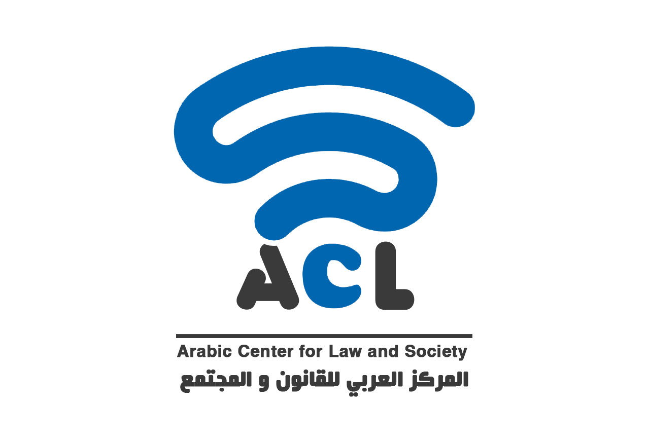
Our logo
The logo, which features a wireless signal, symbolises communication, interaction, and the transmission of messages. The design reflects our vision of using invisible forces to connect people and promote justice and equality. Just as the mind in Platonic philosophy represented an invisible link between individuals, modern technology allows us to connect people and communities through invisible pathways using wireless signals. We drew inspiration from the WiFi symbol, which emerged in the early 1990s as the internet began to spread as a tool for freedom of expression and communication. We aspire to have a similar impact in supporting freedom of expression, highlighting the role of technology in advancing human rights. The "S" letters at the end of the centre's name (ACLSS) further embody this vision.
Simple lines in the logo:
The logo is based on a simple and clear design, reflecting the transparency the organization upholds in delivering its message. This simplicity represents our belief that great ideas can be expressed in a straightforward manner, without the need for complexity.
Black letters in the logo:
The first letters of the center’s name are highlighted in black, symbolizing the deep commitment we dedicate to our legal and regulatory efforts.
Tagline in the logo:
The phrase "Striving for a Just World that Respects Human Rights" directly reflects the organisation's identity and emphasises our commitment to the core values of justice and human rights in clear, easily understandable language.
You can download the logo in PNG format below. Please contact the centre if you require the logo in other formats.
Color palette:
The centre’s colours are inspired by the French flag, with blue symbolizing liberty, white representing equality, and red standing for fraternity, in line with the famous motto of the French Revolution: "Liberté, Égalité, Fraternité." In our modern context, we reinterpret these symbols to encompass concepts such as fairness and inclusivity, reflecting our commitment to advancing the rights of individuals and communities in a complex and diverse world.
Signal colours:
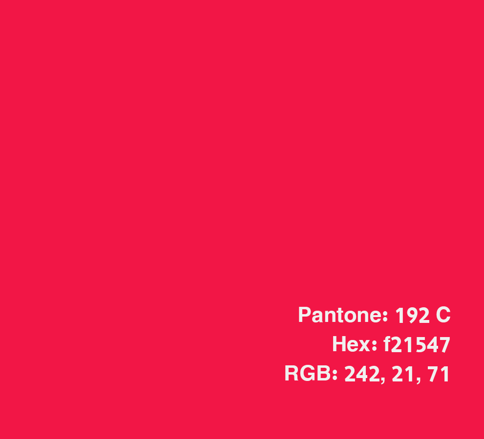
Red
Pantone: 192 C | Hex: f21547 | RGB: 242, 21, 71
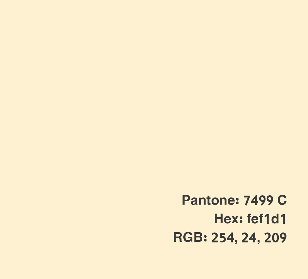
White
Pantone: 7499 C | Hex: fef1d1 | RGB: 254, 24, 209
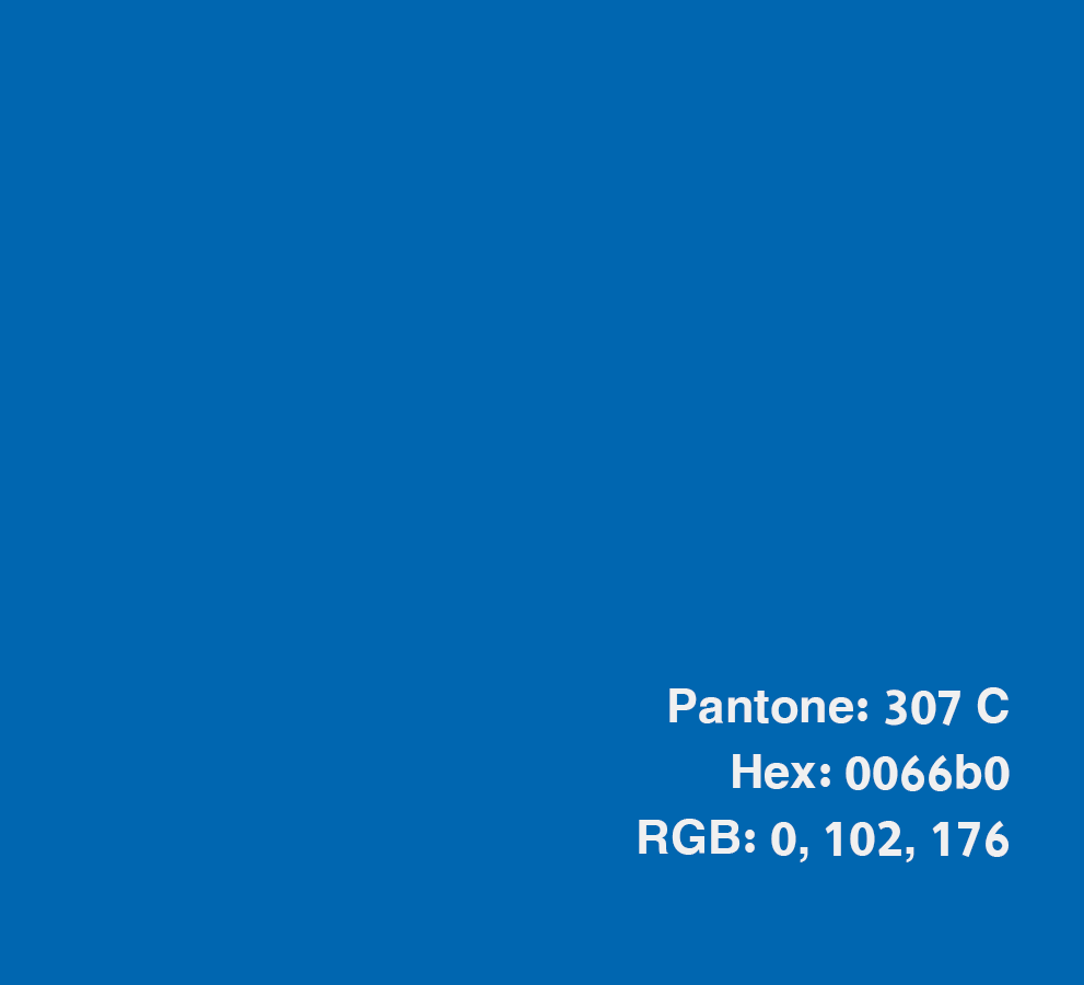
Blue
Pantone: 307 C | Hex: 0066b0 | RGB: 0, 102, 176
Muted colors:
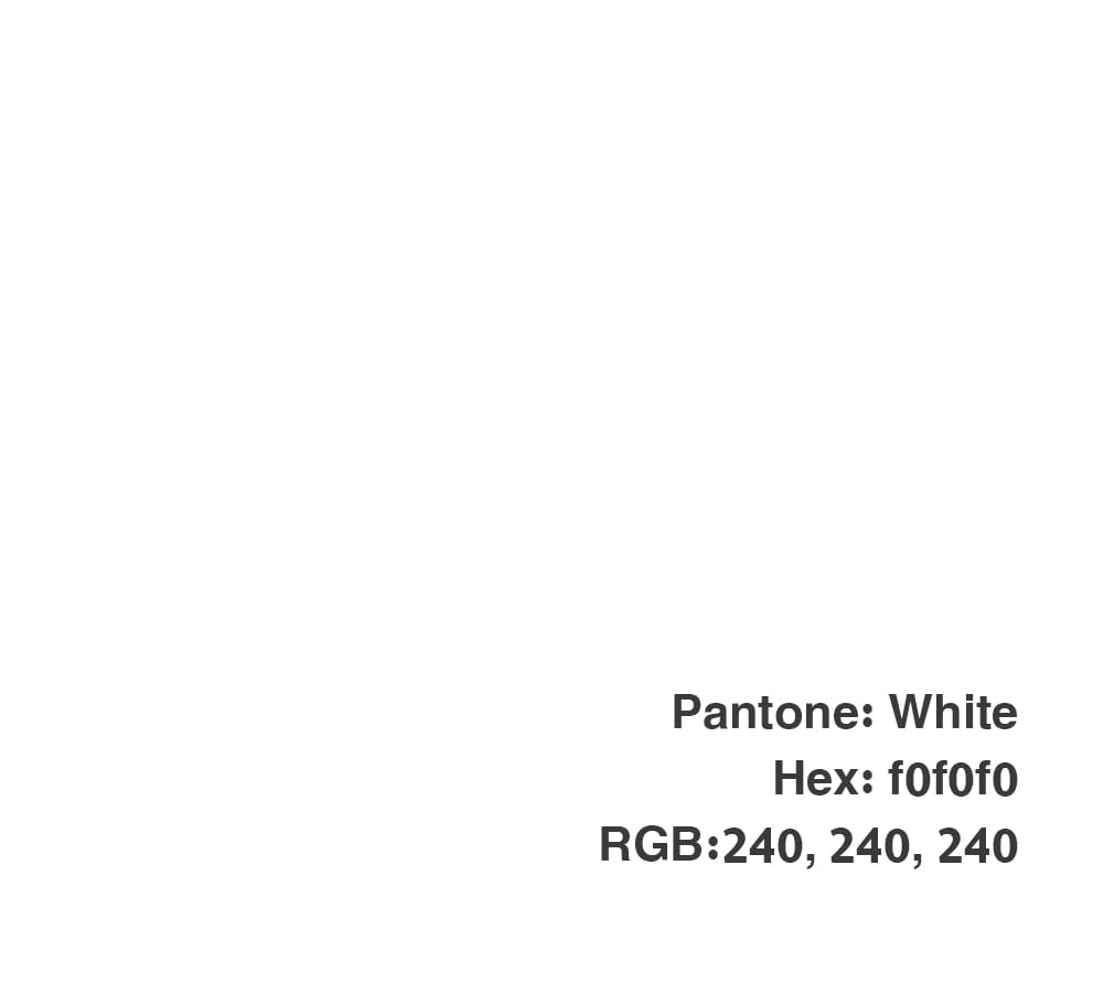
Non-intrusive White
Pantone: White | Hex: f0f0f0 | RGB:240, 240, 240
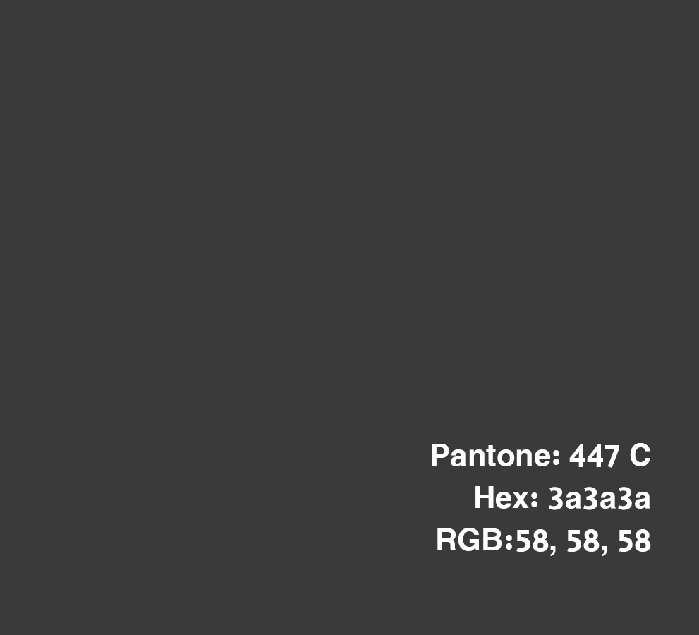
Eye-friendly Black
Pantone: 447 C | Hex: 3a3a3a | RGB:58, 58, 58
Icons
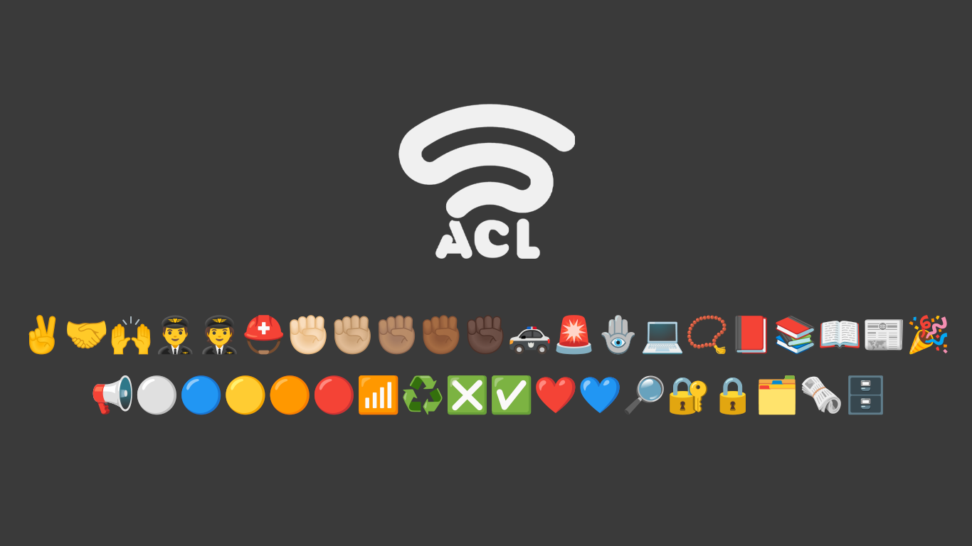
The centre uses a collection of emoji icons that originated with the early spread of text messaging in Japan and have since evolved with the internet to become a universal language for communication, transcending languages and cultures. The use of these icons reflects our deep commitment to the importance of free, non-profit software and globally agreed-upon standards, aiming to maximize the benefit of technology for people.
Font used:
The center uses the Cairo font in its various weights, which is an open-source font available through the Google Fonts package. Designed by Egyptian activist Mohamed Gaber, it is made freely available to everyone under the SIL Open Font License.

Guidelines for using the Center's logo
- Leave space for the logo to breathe:
When using the centre's logo, ensure there is enough space around it to make it stand out. The surrounding space should be no less than 0.5em of the font size used for the letters "ACL.


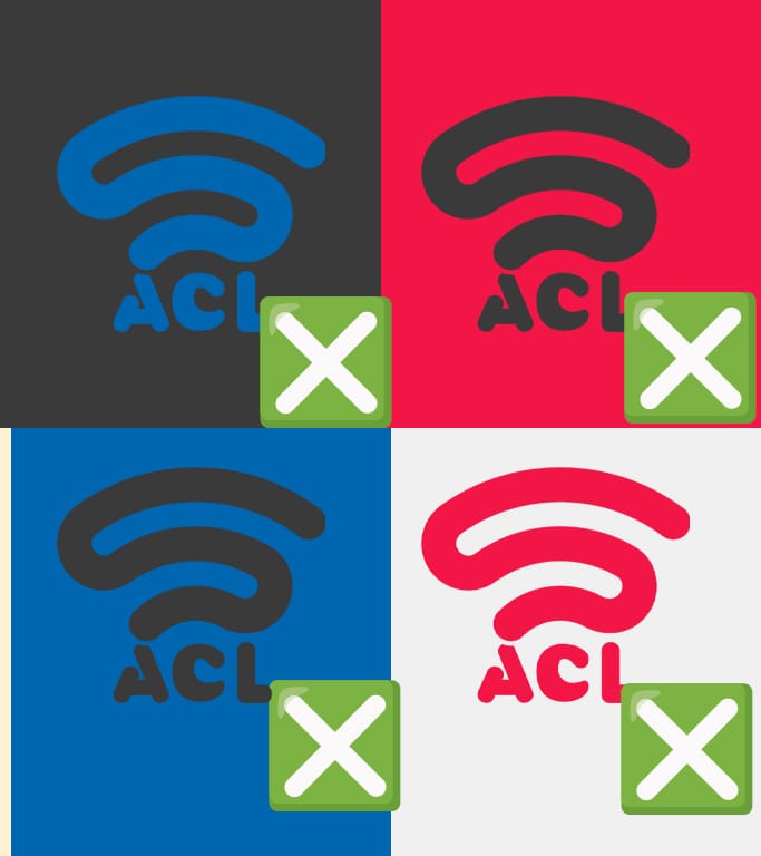
- Do not alter the logo's colors
The centre's logo should always be in a combination of eye-friendly black and blue. Do not change the logo's colours to any other colours than those shown in the provided image.
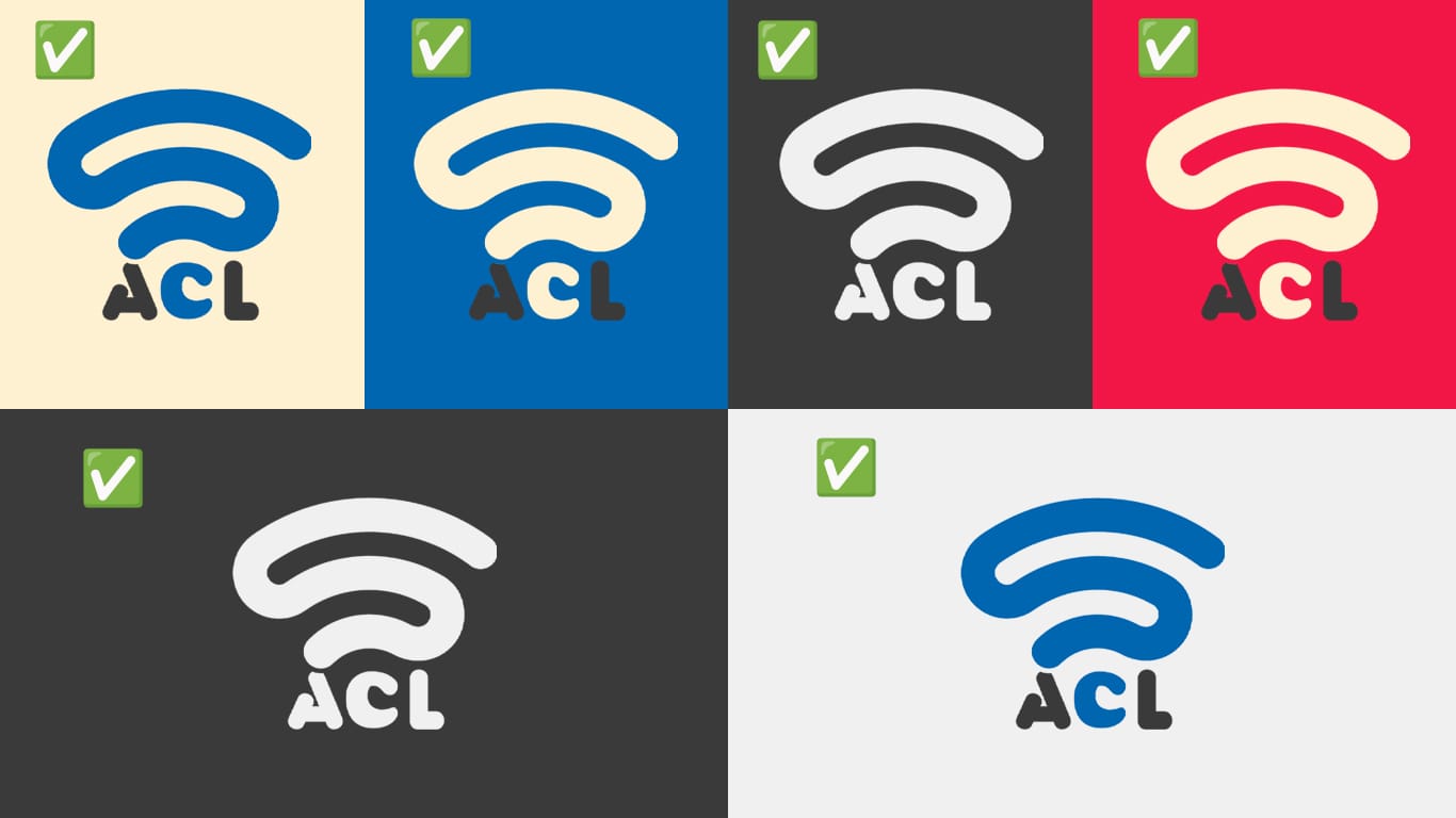
- Always ask yourself: Do You need the dark or regular version?
Above is the version of the centre’s logo in white and blue. When using the logo on a dark background (black or shades of black), always use the non-intrusive white version for the entire logo. On backgrounds in our signal colours, use the contrasting signal colour while keeping the letters "A" and "L" in black. - Should you use the logo with the Center's name or alone?
You may use the centre's logo without the name in most cases. However, never use the logo with the name if the available space makes it unreadable.